Thursday, 7 October 2010

Final Film

Dolly - Student Film from Holly Ward on Vimeo.

The Final version of Dolly, If I had had more time there are things I would have done differently but overall I am pleased to have made this film.

Tuesday, 17 March 2009

Almost Fully Keyed Animatic

Finally! I have done most of the keys, there are a few that are still missing, obviously where there is dialogue and quite a few breakdowns. But I have decided to get on with tweening and fill these in as I go.


A few major changes from the original, mainly the new beginning and the scene where the mother finds the doll. Not planning to make any further changes as I feel it is to late in production apart from tweaking the timings on certain scenes, especially the scene where the camera zooms over the mothers shoulder.


As I said before have now started tweening, aiming to get this all finished to show at the final rush before Easter. Going far to slowly at present for this to be realistic as its less than two weeks away, but I believe it to be possible if I can really get into tweening.


Saturday, 31 January 2009

Asethic Developements and Девочка дура

So been considering my aesthetic while getting on with animating, although I do like the previous Mock ups I created they aren't quite what I want and I'm hoping to improve it or many even change it all together. Gerry showed me the short film Milch by Igor Kovalyov, I dislike how he has done his characters but the backgrounds are stunning. Although quite complex there is definitely inspiration for my own background aesthetic, especially his limited use of colour and the almost glowing misty backdrops.

I also came across the film Девочка дура, which you can watch below.


Really love this short film, and it is much closer to what I had in mind for my own film then anything I have come across before for the aesthetic. I like the simplicity of it and the use of colour.

What I'd now like to achieve for my film is an aesthetic that looks like a moving drawing/illustration, so it will have an unfinished quality, remain quite sketchy and have a few splashes of very light water colour, I would also like to use a paper texture.

To Animating

A week or so into animating the keys now. Took me a while to get into it, and although I'm still slower than I'd like, I feel I'm making progress. Plus for both my story and aesthetic the animation is incredibly important, there is lots of character animation that takes time and needs to be really good. Luckily though the aesthetic I have chosen should be reasonably easy to create so once the animation is done, I'm also (as are most of the 2d people) shooting on digital SLR which will be much quicker than scanning. But I do know I am behind, and really need to pick up the pace.

Had a slight problem deciding how to do my animation, as I normally animate in blue pencil as I like the quality of it. Unfortunately blue pencil doesn't capture or clean up well on the computer. After trying several different ways of animating and cleaning up on a different sheet, i have decided the best option is to do the base animation in blue and clarify and add detail in normal pencil on the same piece of paper. This cleans up better than blue pencil but keeps the construction lines that give the sketchy line quality I'm wanting. Below is a key frame I quickly tried cleaning up.
The first copy is the original file, the 2nd has had threshold applied and the 3rd just levels. Threshold creates the clearest picture and can be turned into just line art and alpha. However I prefer the quality of the line when just levels are used, but this means the texture of the background shows and a pure line art is difficult to create. It may be that this could be used by using blending modes to multiply the image over the background and other layers, this would mean that around the characters there would be a some of the paper texture remaining, but if the edges where feathered it could actually add to the aesthetic.
This will be decided once I have finalised the aesthetic, as I am still developing it, but the most important thing now is to complete the animation.

Wednesday, 14 January 2009

Final Animatic

So this is the animatic I handed in for the animatic deadline.

It now has all the camera moves, and proper layout designs which means some of them camera angles have changed. I have also added rain, to demonstrate that it is actually raining but also to emphasise the moments when it's not raining. Some of the shots have blank backgrounds, these are mostly close ups where the characters are not interacting with the background and I plan for these to just be coloured in the final film as a background is really not necessary and would distract from the characters. I have changed the part where the mother realises that Megan has gone after the doll, by replacing the close up of the umbrella falling to the floor to a mid/long shot of the mother running to the bridge side and rearranging the surrounding shots, I did this as seeing the umbrella fall to the floor is not important for the narrative, and I feel it reads much better as it is now.

Layouts

These are the main layout designs for my film. Originally I tried to draw these out neatly and with a ruler trying to get the perspective exactly right, but this failed to produce the backgrounds I had imagined and a style of line art similar to the Anna and Bella backgrounds below. So I started doing quicker sketches without a ruler and a much thicker and softer pencil, apart from the fact I draw better like this I think the backgrounds are more dynamic this way and appear less empty as it's almost appropriate to leave detail out.

Anna and bella screen shots

The line art for some of the final layouts will need to be cleaner and thinner than the designs below, especially where the layout will be used for close ups. Some of the background designs are more detailed than they may be once in the final aesthetic, but I wish to get the information in partly to increase my understanding of the environment the film is set in but also to help me decide how detailed the background should be.


In the current animatic the background's look almost to much and cause the characters to not stand out. But hopefully once in the final aesthetic where a lot of the detail in the distance will be blurred or even removed with the for ground cleaner coloured this won't be a problem.


The layout below was the most complicated to create as it needs to be moving. In the scene where the mother runs along the river bank searching for Megan I wanted the camera to follow behind as she runs, to hopefully help the audience empathise with her. This of course means she has to run into the background and the background not only get larger but reveal more of itself as she goes further into it. To achieve this I created the picture below with each tree or bush on a separate layer and as whole objects even where they are covered by a object in front. I was then able to import them all in to after effects and using the camera and some clever positioning and re sizing able to create the illusion that the mother is actually running through the trees.


Saturday, 10 January 2009

Trial Full aesthetic Mock up


Thought I may as well try the characters in the background, had to lighten both characters to make them not look like they were stuck on, which means they fade into the background more than I'd like. But your eye is drawn to things that are moving so once they are animated I would expect them to be more noticeable. Still feel this whole mock up is washed out and could do with stronger colour and more defined line art.

Character asthetic


Thought I better have a stab at producing a character aesthetic, now I have started on the background so I can develop the two simultaneously. This is again not finalised, but it is a step towards what I am imagining. Tried to keep it more of a tonal drawing in one colour, this is simpler and hopefully means they will look correct in the background.
Having created the picture above I realised some problems with the mothers character design. She appears to young and perhaps looks more like an older sister than a mother to the girl. I'm hoping I can rectifie this with a few minor adjustments, like buttoning her jacket, widening the leg of the trousers and changing the face slightly. However they do look like they could be related and work well together although the line art could be more consistent.

New Character Rotation - For Girl


Character rotation for the girl, better than the previous one as it is simpler to draw and she looks younger. Still not quite sketchy or dynamic enough but I'm pretty confident that this will come when I animate as I tend to draw a lot quicker and rougher. However the proportions are correct and I like how she looks and is dressed, this will serve as a good guide when I come to animating her.

Background Asthetic


This is my first real attempt at creating a mock up for my background aesthetic. Although by no means finalised I am pleased with the initial results. The line art does need to be bolder and more detailed, with more pencil shading. I feel that it would look better if all the shading was done by pencil rather than in photoshop. The colours are perhaps slightly washed out, I hope that during the film the colour pallet will change slightly to reflect the mood of the characters, this picture is not grey enough for it to be raining or warm enough for the happy ending. However this does have depth whist remaining simple using a small colour range and basically flat colour. This was what I am aiming for as I want the focus to be on the characters not the background.
As said in a previous post my background aesthetic has been inspired by the backgrounds in Borge Ring's Anna and Bella, which are simple, drawn and shaded in Pencil with flat underlying colour.

New Character rotations

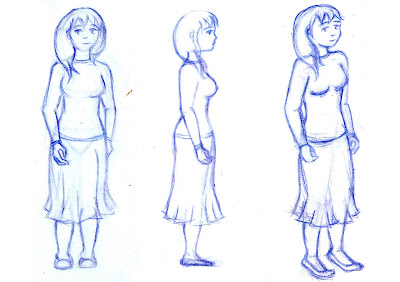
These are the latest model sheets for the Mother and the Doll.
The mother is closer to the final aesthetic as she is more sketchy, but these are the final designs for proportions and clothes etc for both.
Mother
Dolly

I am currently finalising Megan's model sheet as she was starting to look older than she should when I was sketching her. The basic design will be similar to her previous model sheet but she will hopefully look slightly younger and be drawn closer to the aesthetic I am aiming for.

Sunday, 4 January 2009

New Animatic - New Ending and Soundtrack

This is basically the same as the previous animatics, apart from the some of the ending which I have redrawn and changed slightly. I have also used the samples given to me by my composer and voice artist to create a new soundtrack that is closer to the final one, than the placeholders used previously.

I change the ending because as I said before it is the most important part of the story and yet I felt it was the weakest part of the animatic and didn't portray the feelings and emotions it needed to. The new ending I feel is an improvement, as well as being happier it is more focused on the mother and her change of heart towards the doll.

There is only new dialogue for the mother as although I originally planned for Posy Brewer to do both mother and child this didn't work well as we both agreed it would sound better if they were voiced by different people.

The music score is near to completion, needing only a few adjustments, this has been created entirely by Tim Ineson. A link to both his website and Posy Brewer's can be found in the link section at the side of the blog.

Friday, 19 December 2008

Character Model Sheets
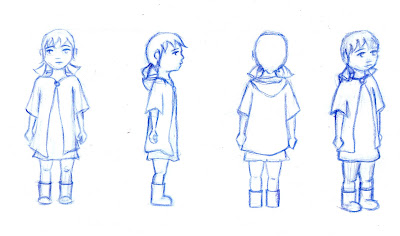


These were my initial try at some rotations for my two characters. Although reasonably pleased with how they came out, they are not how my characters are going to look in the final film, as they are far too detailed and have lost all the charm and movement of the characters I drew for my storyboard.


Megan


Model Sheet


Mother

Model Sheet


I think my final characters will remain quite sketchy and loose, much like the drawings I previously posted, taken from my storyboard. This suits my drawing style but also the background aesthetic I am aiming for, which I think will be similar to the backgrounds in Anna and Bella by Borge Ring. These are quite simple allowing the characters to be the main focus.

Instead of continuing to try and draw accurate rotations I plan to continue sketching both characters in various poses and with various expressions.

Tuesday, 9 December 2008

New Animatic

The latest version of my Animatic, which was shown at the first rush on Wednesday 3rd of Dec.

Basically the same as the previous version but it now contains more sound effects and backgrounds. I have added a shot where the umbrella falls to the ground when dropped by the mother, and also adjusted the scene where mother and child are reunited. Although it works as an animatic in that it tells the story, I still feel the reuniting scene isn't quite correct. The most important part of the story is when the mother realises the importance of the doll and although I've started to portray this in the animatic I think there is another shot needed. This shot will probably be of the Mother watching the child be reunited with her doll. The current shots in that scene also need to be closer to the characters, so that the viewer feels the intimacy of the moment.

Saturday, 29 November 2008

Animatic

This version of the animatic has place holders for sound track and effects and also dialouge.

The dialogue is just me recorded at uni and most of the sound FX came from the uni libirary collection. The sound track is mostly two tracks from Yann Tiersen, Mothers Journey and La Terrase. But the two tracks at the end is the start of two Yael Naim's songs, Lonely and Far Far.

I'm am now working on adding a few more camera moves (done in After effects) and drawing in the missing backgrounds. Will hopefully show this new version in the rushes next wed.

Thursday, 27 November 2008

Calvin and Hobbs Background Aesthetic

The illustrations from Calvin and Hobbes also have essentialy "unfinshed" backgrounds, where only parts that are interacting with the character is shown. Although I don't think I could take this as far as the image below, I do like the idea of showing the edge of the paper, maybe the texture too.

Inspiration from Winnie-The-Pooh


I've always admired the work E H shepard did illustrating Winnie-The-Pooh, It has a almost unfinshed quality and the pictures seem very much to be drawn or painted by hand. I'd really like to replicate this when creating my film.


Below are a few of my favourite pictures that also relate to the subject matter of my film.


Aesthetic

This is a scan from a comic that I own. I really like the sepia tone as it make the highlights really stand out, I also like the use of random textures ie. the leaves. I'm planning on using this image as a basis for my character aesthetic obviously it may need to be simplified as I will have to do it to 1000's of frames. But definatly take the muted colour pallet, the sepia tone and use of patten/textures.


I have been playing around with brown paper for a while now, these three sketches I did drew using pencil, chalk and charcol and the middle one has some water colour pencil too.


I have to confess I did copy the middle one from an oil painting by Audrey Kawazaki.


This picture below by David Revoy uses the same method of drawing onto darker toned paper to make the highlights really stand out. He has created so much depth and texture and made the picture look as if it appeared from the paper, especially by making the grass blank paper.


I love this tonal sketch done in blue pencil (found on google images), it has so much depth and i really like how visible the pencil marks are. Even the where the paper has been left blank adds to the image.


I toying with the idea of using water colour, maybe for both my characters and backgrounds, though not sure whether I would do this in digitaly or by hand. Below is a quick painting I did a while back, just to get back into using water colour. I do like the quality of the colour but not the inked line as it makes it too static.


I much prefere the use of watercolour in the painting below, an image I just stumbled apon on google. It is softer and more fluid. This also has a similar colour pallet to the one I think I will use for my film.


Character Sketches

I haven't done any real character sketches yet, but found that by drawing my animatic I have a much clearer idea of what the three characters are going to look like.These are a few of the stills that have drawings of the characters I really like.
Mother
The mother is the main charcter, I want her to be a sterotypical young mother, obviously affectionate and caring but perhaps not so suited to mother hood yet. I think this can be achieved by making her resonably thin and giving her slightly longer hair.

Doll
Child


I want the child to be cute, as the audience must empathise with her, by making her thin and giving her pig tails i think makes her young but also vunrable. Adding the coat with hood and wellies will also increase her cuteness.

I want the doll to be similar to the child, to enforce the fact that, the way the child feels about the doll is the same the mother feels about the child (well almost). I've decided that i want it to be a rag doll as somehow it seems more vunrable and more cuddley, and it inspires more history perhaps the child made it herself (it will have button eyes).

Hopefully I will produce some rough model sheets soon.


Tuesday, 11 November 2008

Photo Inspiration for Backgrounds

Found this photo in a book called along the riverbank. I decided to post this image as it really captures the type of backgroud i'm hoping to create. Lots of trees and shrubs, but still neat (as it is meant to be set in a park). I want my background to have many layers to increase that sense of depth and create a frame almost out of leaves ect close to the camera.